
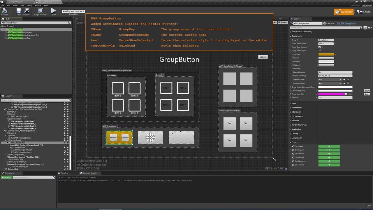
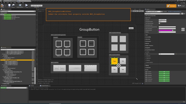
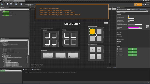
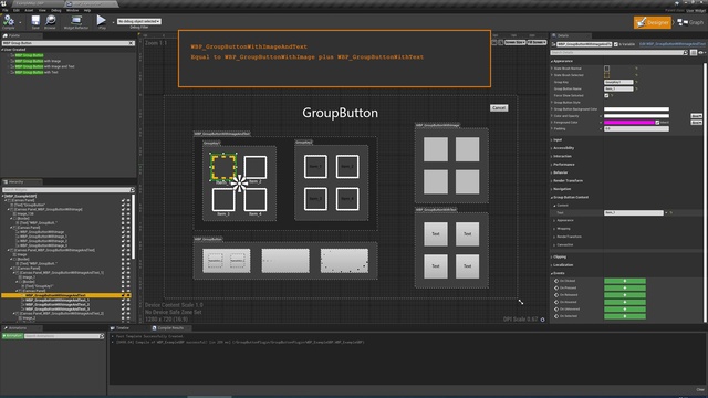
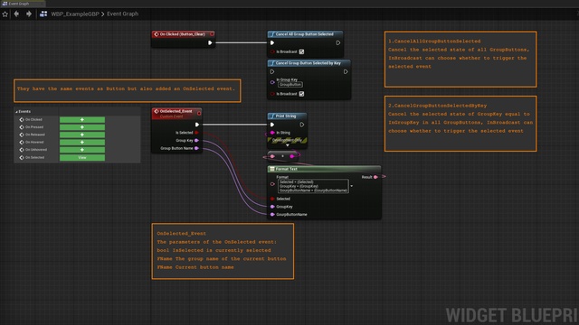
This plug-in adds a group button widget, which is the same as a normal button. This group button adds a selected state and corresponding events. The advantage of the group button is that when this button is selected, a selected event is triggered, and other group buttons in the same group as this button are unselected.
Open the Content Browser window, in the upper right corner of the Content Browser, click the Settings button, This will open a menu where you can adjust various settings for the current instance of the Content Browser, Under the View category, check the Show Plugin Content option, Find the Widget Group Button->Content->Widget Group Button directory, There are sample levels and related assets inside.
Change log : (2021/11)
Modify the workflow, make sure to cancel the selection first and then perform the new selection. Removing the font files in the original plug-in reduced the plug-in size from 30M to 150K.
Change log : (2021/08)
Fix the sound problem.
Change log : (2020/12)
Support 4.26 version
Technical Details
Features:
- Very easy to use!
- It is as easy to use as normal buttons!
- 4 GroupButton templates, covering most usage scenarios
Code Modules:
- GroupButton [Runtime]
Number of Widget Blueprints: 4
Number of C++ Classes: 1
Network Replicated: (No)
Supported Development Platforms: (“Windows”,“Mac”)
Supported Target Build Platforms: ( “Win64”, “Win32”, “Mac”, “Linux”, “Android”, “IOS” )
Documentation: Link
Example Project: Link
You can contact us at any time and request that the asset you want be added to the site from the Request Asset section.